iBudokan Academy
BrandingUser Interface DesignThe Challenge
iBudokan is an online martial arts academy. They asked me to design their virtual academy and brand. It was important for the brand to represent the fighting spirit of the business, but also to illustrate the tradition and values present in these martial sports.
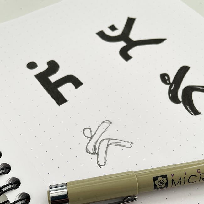
We decided to use bright and energetic colours with hand-drawn lettering, where the "K" represent the fighter. We also used the "K" as an icon and responsive logo.
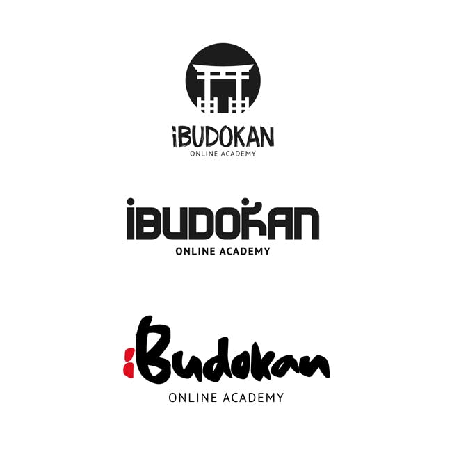
I wanted an energetic colour palette that represented the origins of martial sports, so Blood Red seemed the perfect accent colour. It represents the passion and love for the sport, and at the same time links to the orient countries where most of these sports originated from.
#0C0C0C
#E30613
#F8F8F8
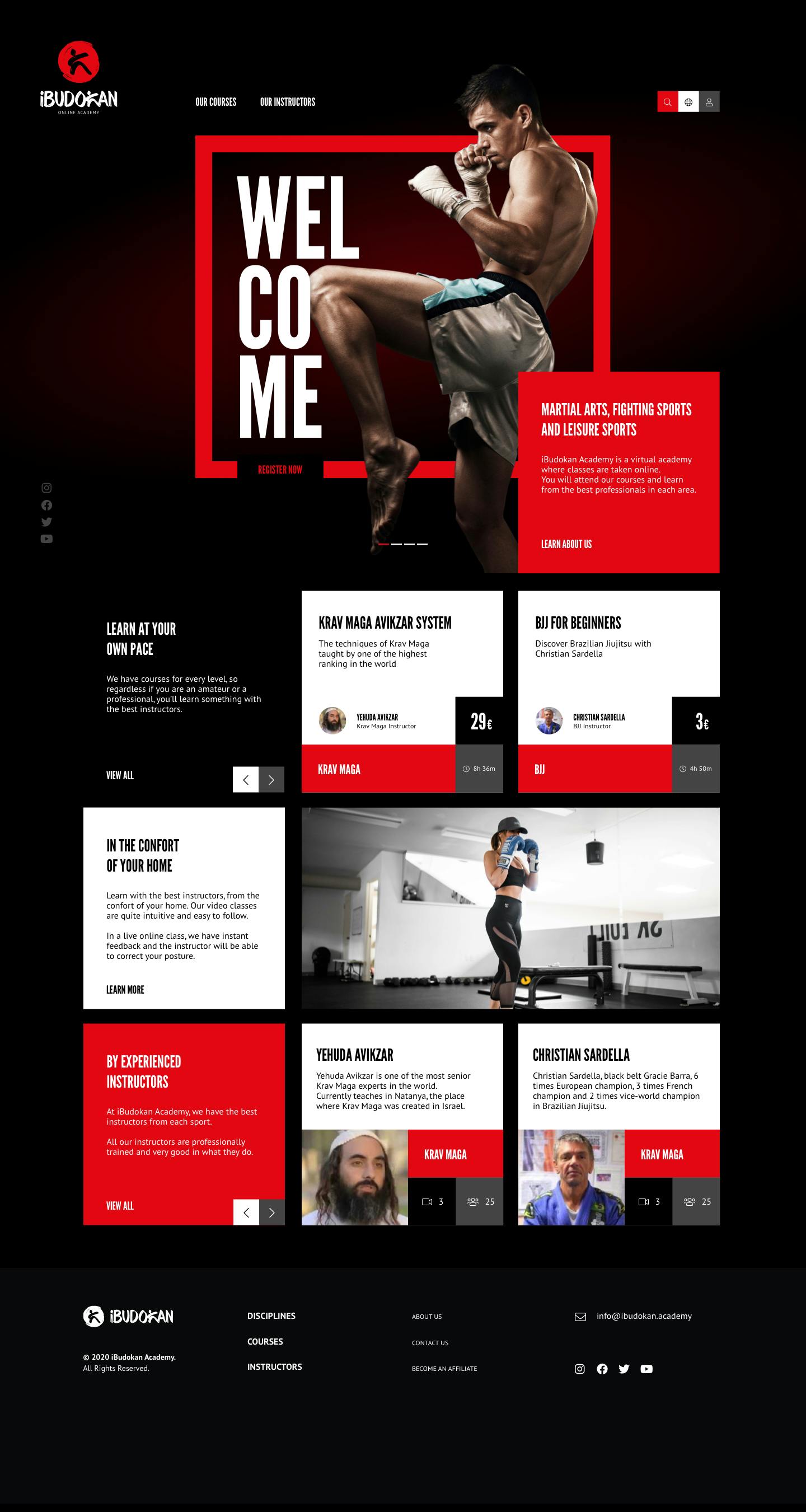
Website Design
We wanted to create a modern and engaging layout. Started with an impactful welcoming area, introducing the academy. Courses and instructors are displayed on a grid system, making all the pertinent information available from the home page.