Monte da Bica
BrandingGraphic DesignMerchandisingThe Challenge
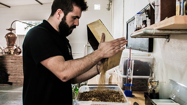
I was challenged to develop the branding for a new distillery in Portugal. The goal was to develop a flexible brand to be used across different media, which illustrated the process of distillation.
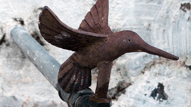
It was important to show the classic relevance of the place, established in 1944, as well as design a responsive logo that could be used in several formats and sizes. One of the main inspirations during our research was an old copper tap located in the main water fountain, in the shape of a hummingbird. Hummingbirds are in constant search of the best nectars and nutrients, and it seemed the perfect representation of the distillation process and, therefore, the identity of the distillery.
I used an elegant and warm palette, making use of the copper as the main colour. This colour represents the copper stills.
Pantone Black 7 C
C72 M64 Y58 K52
#36383C
Pantone 876 C
C72 M64 Y58 K52
#95694D
Pantone Cool Gray 2 C
C15 M11 Y13 K0
#DBD9D6
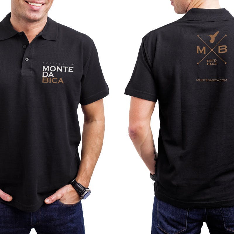
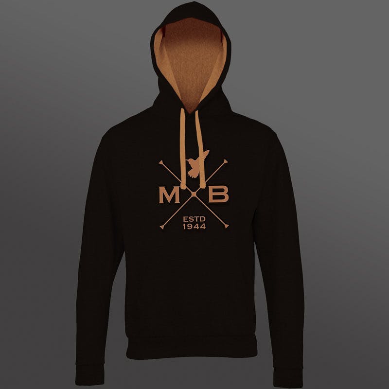
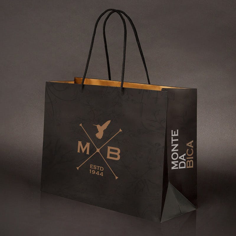
Merchandising
I also developed a series of promotional material, uniforms and merchandising, both for internal and commercial use.